Color
Primary palette
The primary palette is built on the dark blues, lightening through a range of neutral greys. The dark blues can also run as gradients: a linear blend between two stops. Text is always light on dark or dark on light.
Black 6 C #030303
5395 C / 532 C #112033
534 C #1B3754
Cool Gray 1 C / 663 C #EBEBEB
Cool Gray 2 C #D6D6D6
Cool Gray 5 C #B0B0B0
426 C #313131
Data colour
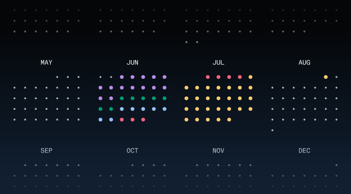
The data-colour system runs on two fixed palettes, each with a job: one colours the training stages, the other separates the series in charts and graphs.
System prompt
The fixed colour for each training stage on the calendar. Use these exact values when colouring stages in calendars, plans or schedules.
System prompt
One colour per line or category in charts and graphs. Assign in order.
AI prompt
The highlight blue signals AI — actions, thinking and responses that come from the NoClue Model. It’s the single accent that steps outside the dark blues and greys, used only to signify these actions.
System prompt
The prompt pill carries an AI action. Its stroke runs an animated gradient while the NoClue Model works — a thinking state people already read as processing, so the user knows the request is being actioned while they wait.
Stroke rotation: clockwise. Gradient colours in order, looping back to the first:
Image treatment
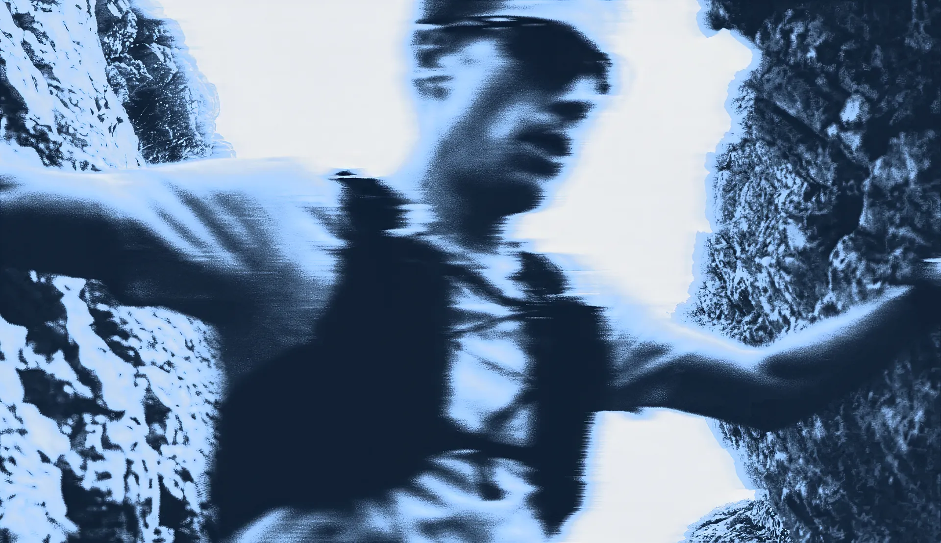
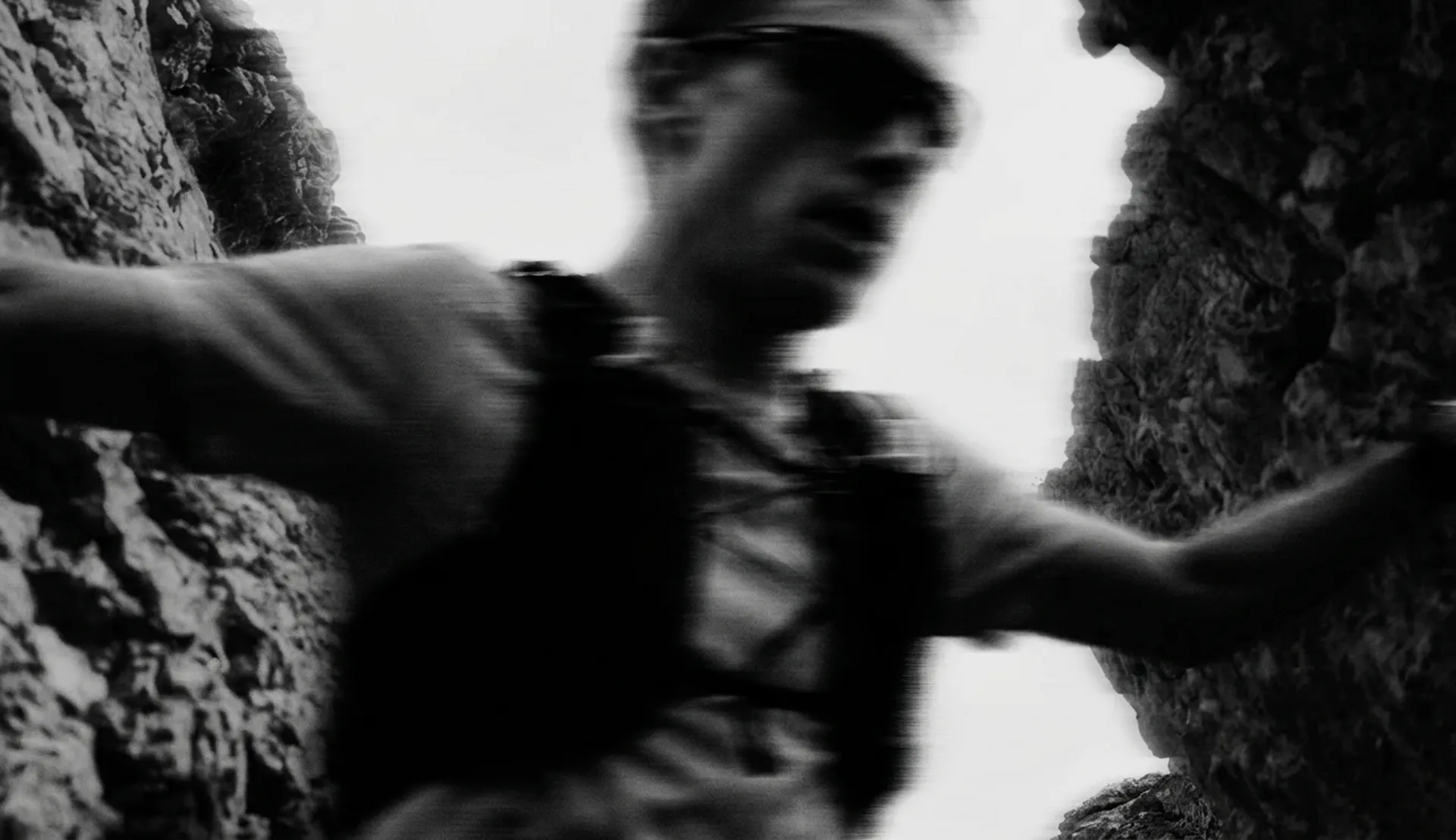
The image treatments are for key marketing and high-stakes artwork, not everyday content. They mark a piece as unmistakably NoClue.
 Black & white
Blue
Black & white
Blue
System prompt
Black and white — a full desaturation to neutral greyscale, with no colour retained. The tone curve is pushed hard: shadows crushed close to pure black, highlights lifted to near-white, and a broad mid-grey range held between. Heavy directional motion blur smears the frame, and a fine film grain sits over the top to keep it cinematic and raw.
Blue — a duotone gradient-map into the brand blues, applied over the same high-contrast, motion-blurred base. Shadows map to a deep navy (#122236, close to Aero Slate), midtones climb through slate blues (#1F324B, #334B69, #4F6D92), and highlights lift into a light sky blue (#ACD2FC) and a pale cool white (#E1E7EF). A digital, glitched edge sits on top — chromatic shift and scan-line displacement across the frame.